What's Actually Going On
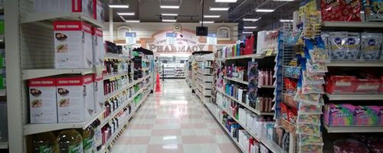
Packaging design that performs well in the Chinese market — bright, saturated colors, dense promotional text, bold headline claims — often looks out of place on a US shelf. American consumers' visual habits and shopping decision patterns differ noticeably from domestic ones, and packaging that's "eye-catching" by Chinese standards can instead come across as unfamiliar and unprofessional in a US shelf context.
This isn't a question of which aesthetic is better — it's a question of context fit. On US retail shelves, clean, restrained visual language with more white space is often read as a signal of quality, while information-dense packaging tends to be read as cheap or untrustworthy.
A Real Example
A kitchenware product that sold well in China kept its domestic design style — bright colors, promotional text covering the front. When tested on a US retail shelf, buyer feedback was "looks like cheap flea-market merchandise." After redesigning it in a cleaner style, buyer reception for the same product improved noticeably.
So What Should You Actually Do
- Study the visual style of existing products on your target channel's shelves, and find a design language that fits local aesthetic habits.
- Be bold about subtracting — bring down the information density on your packaging and keep only the core selling points.
- Once the design is done, test first impressions with real US-based people unfamiliar with the Chinese market, not just your internal domestic team.